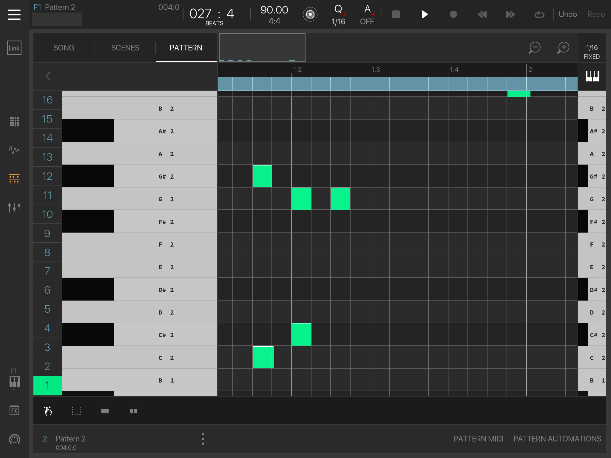
Yes i have tried to explain to Intua on multiple occasions that a crappy tiny little keyboard for previewing where every other app in the history of software would have a scrollbar, and a huge keyboard for a scrollbar where every other piano roll in the history of software would have the preview, is a bad idea.
But wait, it gets better still, the crappy little keyboard rarely works that well for previewing because it is too close to the edge of the screen AND doubles as a scrollbar too !!!
But it falls on deaf ears, they prefer to reinvent the wheel and make it square with some of this stuff
User experience and a good workflow is not high on their priority list, combined with features being removed in each release it is starting to put me off using BM3 very rapidly.
The keyboard is there because when using the non key mode it acts as a list instead. It’s there as a reference but you can just collapse it. I do agree with 5pin above though.
Only 'function' I've found on for the left side-keboard is to long-tap on it and select 'rows'.
What drives me nuts is that the 'numbers' far left represent the 'pads' but it's just impossible to switch to another pad without first leaving the keys mode to select another pad and then return to keys mode when all it would take would be to tap on the number to switch the editor view...
I persevere with BM3 cos it feels like it's heading somewhere solid and genuinely progressive. But agree with @5pinlink that a re-think/overhaul with some of the fundamental workflow/view options wouldn't be a bad idea.. Just copy what's already out there for this stuff, it's tried and tested
Cubasis is infinitely more fluid/less chaotic in general sequencing/editing workflow and just feels more natural in terms of having a standard toolbar along the top with buttons that open windows for keys/pattern edit etc and allow you to curate your own workspace in a fluid way with flexible multiple tools/views on screen at same time. It'd be a shame if BM3 doesn't do a kind of u-turn with some of this stuff..
I suggested a 'keys' overlay option a while back and got met with mixed opinions on it. After now having used cubasis a few times I can't really see how anyone can say it isn't a better way of doing things, feels waaaay less chaotic compared to switching entire view in BM3 for different tasks.
Would also really like the 'audition note when moved around screen' functionality to make a comeback. As an option in settings. Often find that pretty useful.. Not sure why that got totally removed in a recent update. Seems like something to have thrown in to settings for users to decide on..
@Heyez said:
Would also really like the 'audition note when moved around screen' functionality to make a comeback. As an option in settings. Often find that pretty useful.. Not sure why that got totally removed in a recent update. Seems like something to have thrown in to settings for users to decide on..
That 'function'(note preview) could have some built-in logic. If the sequencer is running do not audition notes, if the sequencer is not running audition the notes or something in those lines...
Even though Cubasis lacks certain features it's quite nice to work with.
Just need to take some time to prep the mini-sampler with custom samples and it's all set.
(Still hoping Steinberg will add the 'Sampler Track' from Cubase to Cubasis).
@Heyez said:
Would also really like the 'audition note when moved around screen' functionality to make a comeback. As an option in settings. Often find that pretty useful.. Not sure why that got totally removed in a recent update. Seems like something to have thrown in to settings for users to decide on..
I finally remembered why that was removed, it was somebody who was entering notes live, to load as a pattern in a scene, but didn't want the note to be previewed while other stuff was playing back live (Understandably)
But removing features rather than making them optional has really annoyed me today ( I used note off quantize all the time and it is now gone)
In the interest of honesty, I have just emailed Mathieu to discuss these features going missing, but i did forget to mention the note preview option needs to be reinstated as an option (Little speaker icon up by the magnifying glasses or something ? )
The option for ‘Note Auditioning’ could be placed along the bottom ‘black’ tool bar. There is plenty of room there. What’s there already only takes up about a sixth of the space.
Going to the setting to toggle would mean changing screen in the middle of editing, back n forth.
@Heyez said:
I persevere with BM3 cos it feels like it's heading somewhere solid and genuinely progressive. But agree with @5pinlink that a re-think/overhaul with some of the fundamental workflow/view options wouldn't be a bad idea.. Just copy what's already out there for this stuff, it's tried and tested
Cubasis is infinitely more fluid/less chaotic in general sequencing/editing workflow and just feels more natural in terms of having a standard toolbar along the top with buttons that open windows for keys/pattern edit etc and allow you to curate your own workspace in a fluid way with flexible multiple tools/views on screen at same time. It'd be a shame if BM3 doesn't do a kind of u-turn with some of this stuff..
I suggested a 'keys' overlay option a while back and got met with mixed opinions on it. After now having used cubasis a few times I can't really see how anyone can say it isn't a better way of doing things, feels waaaay less chaotic compared to switching entire view in BM3 for different tasks.

Comments
Yes i have tried to explain to Intua on multiple occasions that a crappy tiny little keyboard for previewing where every other app in the history of software would have a scrollbar, and a huge keyboard for a scrollbar where every other piano roll in the history of software would have the preview, is a bad idea.
But wait, it gets better still, the crappy little keyboard rarely works that well for previewing because it is too close to the edge of the screen AND doubles as a scrollbar too !!!
But it falls on deaf ears, they prefer to reinvent the wheel and make it square with some of this stuff
User experience and a good workflow is not high on their priority list, combined with features being removed in each release it is starting to put me off using BM3 very rapidly.
The keyboard is there because when using the non key mode it acts as a list instead. It’s there as a reference but you can just collapse it. I do agree with 5pin above though.
Only 'function' I've found on for the left side-keboard is to long-tap on it and select 'rows'.
What drives me nuts is that the 'numbers' far left represent the 'pads' but it's just impossible to switch to another pad without first leaving the keys mode to select another pad and then return to keys mode when all it would take would be to tap on the number to switch the editor view...
I persevere with BM3 cos it feels like it's heading somewhere solid and genuinely progressive. But agree with @5pinlink that a re-think/overhaul with some of the fundamental workflow/view options wouldn't be a bad idea.. Just copy what's already out there for this stuff, it's tried and tested")
Cubasis is infinitely more fluid/less chaotic in general sequencing/editing workflow and just feels more natural in terms of having a standard toolbar along the top with buttons that open windows for keys/pattern edit etc and allow you to curate your own workspace in a fluid way with flexible multiple tools/views on screen at same time. It'd be a shame if BM3 doesn't do a kind of u-turn with some of this stuff..
I suggested a 'keys' overlay option a while back and got met with mixed opinions on it. After now having used cubasis a few times I can't really see how anyone can say it isn't a better way of doing things, feels waaaay less chaotic compared to switching entire view in BM3 for different tasks.
@samu +1 that bugs me too. Annoying that it doesn't switch when selected..
Would also really like the 'audition note when moved around screen' functionality to make a comeback. As an option in settings. Often find that pretty useful.. Not sure why that got totally removed in a recent update. Seems like something to have thrown in to settings for users to decide on..
That 'function'(note preview) could have some built-in logic. If the sequencer is running do not audition notes, if the sequencer is not running audition the notes or something in those lines...
Even though Cubasis lacks certain features it's quite nice to work with.
Just need to take some time to prep the mini-sampler with custom samples and it's all set.
(Still hoping Steinberg will add the 'Sampler Track' from Cubase to Cubasis).
I finally remembered why that was removed, it was somebody who was entering notes live, to load as a pattern in a scene, but didn't want the note to be previewed while other stuff was playing back live (Understandably)
But removing features rather than making them optional has really annoyed me today ( I used note off quantize all the time and it is now gone)
In the interest of honesty, I have just emailed Mathieu to discuss these features going missing, but i did forget to mention the note preview option needs to be reinstated as an option (Little speaker icon up by the magnifying glasses or something ? )
The option for ‘Note Auditioning’ could be placed along the bottom ‘black’ tool bar. There is plenty of room there. What’s there already only takes up about a sixth of the space.
Going to the setting to toggle would mean changing screen in the middle of editing, back n forth.
King
..
Yeah it should just be a preview icon, ala sample preview, toggle it on as needed while working in the piano roll.
+1000