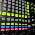
Settings behavior/option to disable bank text/numbering of pads?
Not sure if this has been requested before but when using performance view (in 64 pads mostly), I find the bank #/pad# text on each pad (i.e. A1.101) a deterrent to my creativity and/or focus. When reading top to bottom it isn’t too bad as our named pads are named at the top of a pad.
Bottom to top screen reading; however, gets in the way. I think for users who already understand which bank they are in, a pads midi note values , a pads number it would be nice to have an option to hide these texts. It would also clean up the view we use to perform for some users making this window much more enjoyable. Maybe even a pad name hiding option. I don’t know. What does anyone think?

Comments
To understand where I’m coming from with this from an UI perspective is two-fold. I’m not sure if our human brains are able to quickly process colors, text, and shapes simultaneously without white space (empty space). If your mind is set on production, this information all at once is ideal. For performance, not so much. Almost every single external piece of gear does not have labeling on their pads. Keys mode is fine. We need that reference. To boost performance view up when performance is in mind, this setting would be a treat.