Added a general important links sticky to the forum, also contains a full changelog.
Fixed the broken thread links in samplebanks list (Thanks @huphtur)
So it looks like there was a theme update or something, as now my dark themed desktop version which used to be responsive on mobile is replaced with a light version that isn't responsive, and the actual mobile site is still the same stripped down facebook classic looking thing. Do we know anything about this change?
I couldn't actually remember for sure but I don't think the home button showed at the bottom of the page on my 7+, I always tap the status bar at the top to scroll all the way up and then tap home up there.
@ronji said:
I couldn't actually remember for sure but I don't think the home button showed at the bottom of the page on my 7+, I always tap the status bar at the top to scroll all the way up and then tap home up there.
It used to be there in the white version under the textbox. Just wondering if I accidently switched to the non mobile version... but that one has a home link too. This version of the forum looks rather funny on a small screen 🤔
Trying to find the status bar to tap it, but so far I’m tapping in vain 🤪😂
@denx Yeah it's there on a larger screen device like iPad or computer, but on a small screen like a phone it isn't there, in the desktop version of the site. I always run desktop version because I hated the white and blue mobile version. Perhaps that mobile version is gone now? I can't seem to get back to it now.
I actually liked the mobile version. It suited my 5.5” android phone much better and the font size was about right too. Since the forum was updated I get the same theme across all devices now.
The biggest issue with the full theme on my phone (portrait mode) is that the avatars are too big and indent the text so far I sometimes only see 4-5 words per line.
@tk32 said:
I actually liked the mobile version. It suited my 5.5” android phone much better and the font size was about right too. Since the forum was updated I get the same theme across all devices now.
The biggest issue with the full theme on my phone (portrait mode) is that the avatars are too big and indent the text so far I sometimes only see 4-5 words per line.
Comments
Added a general important links sticky to the forum, also contains a full changelog.
Fixed the broken thread links in samplebanks list (Thanks @huphtur)
So it looks like there was a theme update or something, as now my dark themed desktop version which used to be responsive on mobile is replaced with a light version that isn't responsive, and the actual mobile site is still the same stripped down facebook classic looking thing. Do we know anything about this change?
Trying out something new with themes, this might or might not be definitive. Vanilla forums lack good, clean designs...!
EDIT: Done, the theme is slightly different and a bit brighter.
Ooh, now I've got a responsive theme again, it's a dark theme, but I'm into it so far. Way better than the light and not responsive theme!
I like this version better too! Easier on the eyes for me and looks sleek.
Minty fresh
I have to be honest, im not a big fan of the blue and green personally.
Most of the rest is much hetter though, text entry boxes etc.
Maybe the blue and green are new color elements from the 3.1 update, and the forum needed to be updated to match before release
I did slightly worry that @mathieugarcia might 'break the internet' with this forum update.
It's likely to make the world wonder if he's getting ready to drop 3.1
Love the new flava
I like it
Ahhh, new forum smell, love it.
This is nice.
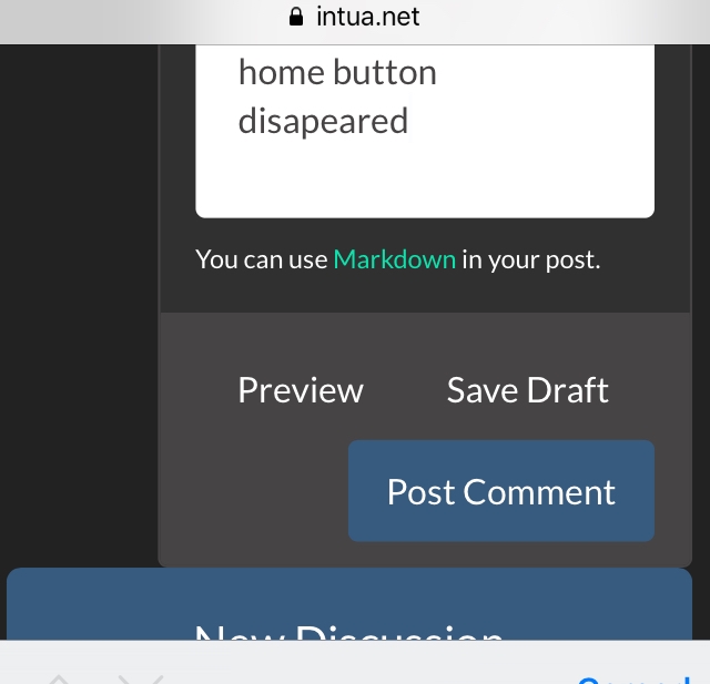
Looks a bit weird on my se, though. And the home button disapeared. Any ideas?

Cheers!
I couldn't actually remember for sure but I don't think the home button showed at the bottom of the page on my 7+, I always tap the status bar at the top to scroll all the way up and then tap home up there.
It used to be there in the white version under the textbox. Just wondering if I accidently switched to the non mobile version... but that one has a home link too. This version of the forum looks rather funny on a small screen 🤔
Trying to find the status bar to tap it, but so far I’m tapping in vain 🤪😂
This is what I mean, maybe I shouldn’t have called it a button 😬
@denx Yeah it's there on a larger screen device like iPad or computer, but on a small screen like a phone it isn't there, in the desktop version of the site. I always run desktop version because I hated the white and blue mobile version. Perhaps that mobile version is gone now? I can't seem to get back to it now.
The status bar on an iPhone is the very top of your screen, where the time and network and battery info are.
I actually liked the mobile version. It suited my 5.5” android phone much better and the font size was about right too. Since the forum was updated I get the same theme across all devices now.
The biggest issue with the full theme on my phone (portrait mode) is that the avatars are too big and indent the text so far I sometimes only see 4-5 words per line.
Yup, same here...
@ronji thanks for the clarification, works like a charm 😊