2.3's graphical changes

One of the reasons I like beatmaker a lot is/was the great gui especially for the sequencer: decent colors, easy for the eye, well sorted and well established details.
The more I was a little dispointed about the latest changes, which are a decline in quality of graphics to my opinion.
What made it less beautyful was:
- the Miss Piggy pink <!-- s:? --><img src="{SMILIES_PATH}/icon_e_confused.gif" alt=":?" title="Confused" /><!-- s:? -->
- the bright color fields of each track instrument
- useless angeled fields and triangles here and there, to fill up space or whatever
- the flat look of the tracks on the left kills the overall impression
- minor: the icons for highlighted items like select are totally blurry (and the white color was better than the black now)
In total the interface became less consistent and with a childish look, I think.
I waited a long time after updating to see, if I get used to it but still I do not like it so much. So I made alittle mockup, how I would like to see it again; pretty much recreated the graphics of 2.2, but with the new features.
compare 2.2, 2.3 and my mockup
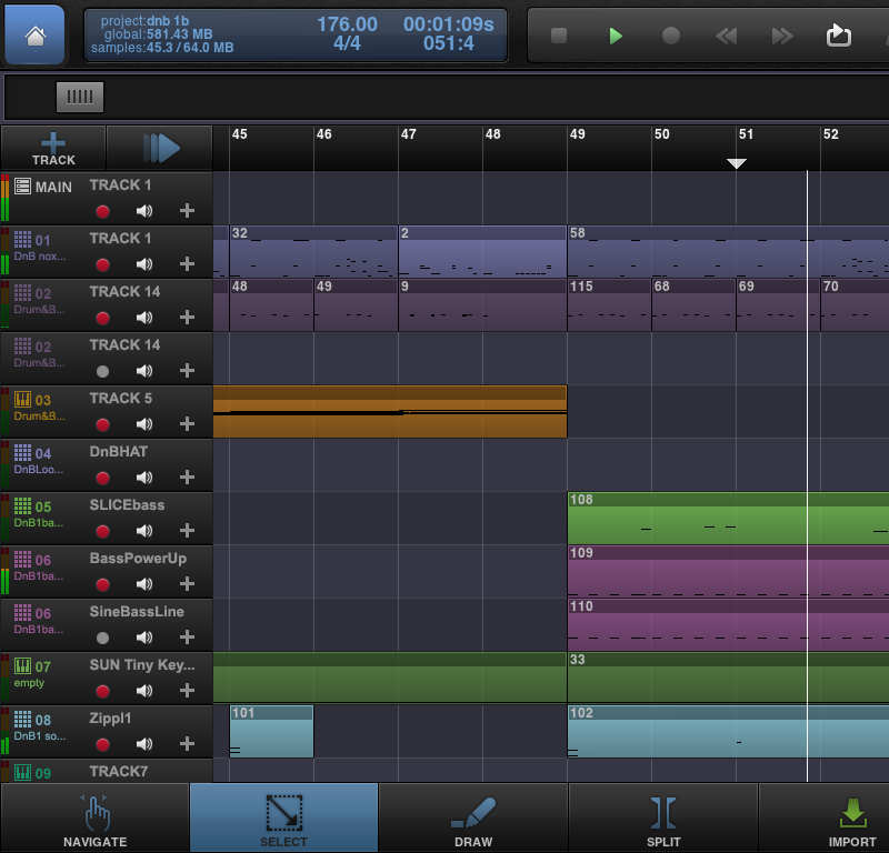
2.2
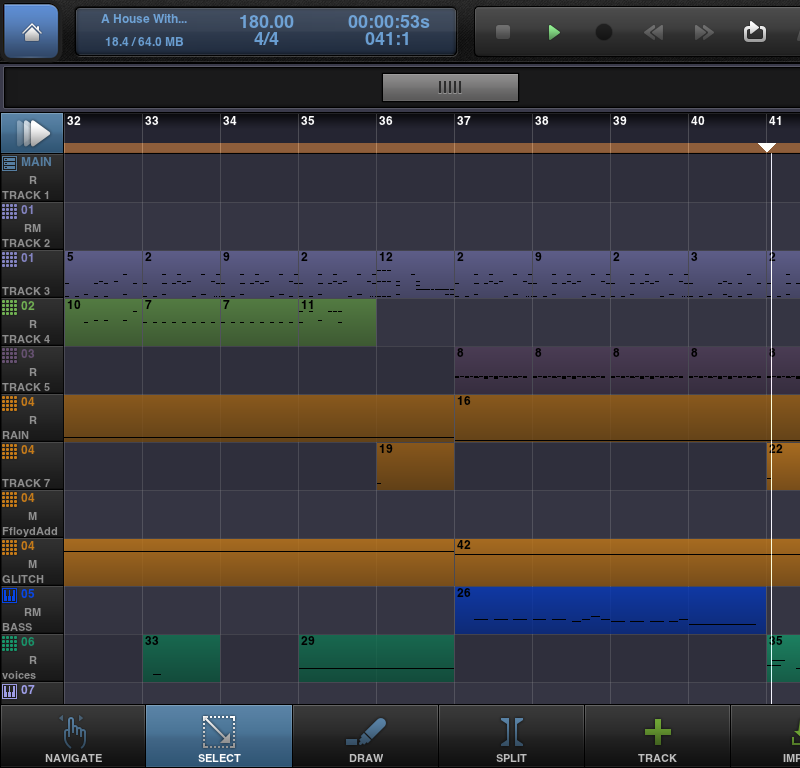
2.3
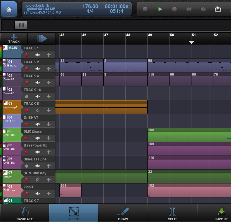
mockup
Btw. it is not THAT big problem, but anyway I wanted tell it was better before.
The more I was a little dispointed about the latest changes, which are a decline in quality of graphics to my opinion.
What made it less beautyful was:
- the Miss Piggy pink <!-- s:? --><img src="{SMILIES_PATH}/icon_e_confused.gif" alt=":?" title="Confused" /><!-- s:? -->
- the bright color fields of each track instrument
- useless angeled fields and triangles here and there, to fill up space or whatever
- the flat look of the tracks on the left kills the overall impression
- minor: the icons for highlighted items like select are totally blurry (and the white color was better than the black now)
In total the interface became less consistent and with a childish look, I think.
I waited a long time after updating to see, if I get used to it but still I do not like it so much. So I made alittle mockup, how I would like to see it again; pretty much recreated the graphics of 2.2, but with the new features.
compare 2.2, 2.3 and my mockup
2.2
2.3
mockup
Btw. it is not THAT big problem, but anyway I wanted tell it was better before.
Comments
It's all a matter of preference.
and would be cool to rearrange the tracks