Mockup - Sample Auditioning

The idea is to add a more robust sound browser that has sample auditioning features allowing the user to quickly jump through long sound files, audition ranges, assign sample ranges to pads and even record quick sketches via playable pads all from one screen.
I could see for more sound montage styled projects, starting in this view and being here for quite a while, saving a lot of time on the initial sketch / auditioning / sound curating phase without the need for screen diving.
Comments
While i do enjoy this in Reaper, especially for loops and longer audio files, and i would like something like this in B3, I still prefer the Maschine context preview in the browser for drumhits and kits etc, so personally i would want both styles of browser preview if this is one was implemented.
Current preview is extremely weak part of B3, no tempo sync, no context preview, it is very outdated.
Huh... this is in Reaper? Cool... I was thinking more of how I use Samplitude and Resonic together.
Its Reaper, of course this is in there lol, audio can be routed to anywhere while previewing, even to a second set of speakers or headphones, or to the selected track, you have a wave editor so you can select what you hear or drag to the timeline, there is a list of import options so vast i cant even type them here.
It has start on bar, tempo, x2 tempo, .5 tempo etc etc etc.
It not only supports audio but does the same with MIDI, so you can route it to any MIDI port or indeed a track with plugin on.
It also does the same with full projects, but when you try to import it gives the option of new project tab or PIP, PIP is project in project and loads the project as an item on the arranger, which can be opened and edited but also works exactly like an audio file.
So yeah nice browser for sure, but with B3 basically being a modern Maschine, it would be terrible to not get the in context previewing too, so you could click on a kick in the browser for example, and that kick would start playing the steps for the currently selected pattern, in context with everything else playing, its a great fast way for setting up kits/Instruments.
Really all we need is a new load type "Change sample, keep settings" for that preview type.
@5pinlink
Yah ‘change sample, keep settings’ seems like low hanging fruit for sure.
I wasn’t really thinking of loops or beat matching with this but yah, I think I will update the mockup with that. Loops are a part of life after all.
@5pinlink
Alrighty, updated with a nod to some sort of 'tempo fit' karate chop action and some basic play,stop,loop transport for the sample preview.
Keep in mind that tempo fit isnt always about loops, if you record vocal or instrument or whatever in Reaper for example, you can embed the tempo info in to the wavefile, so it could be a six minute long synced audio file")
I have not used embedded BPM info. In this case it is more about using the range to calculate the tempo adjustment. Once the tempo is set you could select any nonloop range.
In the end the Lords of Intua shall do as they shall and this is mainly my fanboy sketch.")
Point taken, I will shut up haha.
No please, kick the tires!")
Also, if there is a video of the Maschine context preview I would love to see it.
++ 1
This is REALLY needed for a sampler daw based app
@Audiogus good mock-up in terms of how to speed up work flow, reduce the number of screen presses to do something, and cut down on page switching
In my opinion it's a mistake that so many features are crammed into that little panel on the side, and cramming more into it only exacerbates the issue. I don't see why there's this great big navigation panel for only four pages.
Use the menu to access app settings. Make a folder icon on the navigation bar for project/bank/sample file management. Use the side bar for the directories and the remaining screen for the directory contents. Space out the editing functions.
For all the benefits that Beatmaker offers, having to squint to read cropped dark grey text is quite unforgivable. I stopped using Retronyms apps for that singular reason, ugly disfunctional UI design. It's a real shame Intua is following suit.
Oh yah. Would love to rework the whole BM3 UI... particularly around my specific workflow.")
Other than dragging a sample onto a pad the pads do nothing while you're browsing samples, banks, saving and moving things around. It's a GIGANTIC waste of space for a little gimmicky feature. Of course, no app is perfect, but that's no excuse for all the headaches involved in simple file management problems that Intua had already solved in version 2 a long long time ago.
Edit: Didn't see your folder icon. Yes I completely agree with you on that, only instead of having the pads on screen I'd have some version of the sample edit window as you've already placed there with the arrows allowing you to toggle between pads. Above that I'd have the subdirectories or folder contents with all kinds of different sort fields, and a search bar, "Name," "Date" "Tag" DONE.
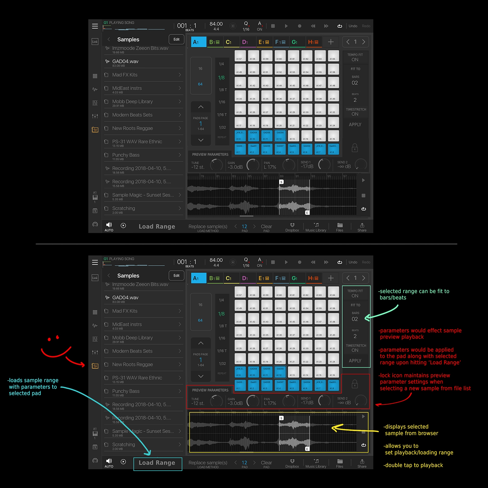
This would not be a file manager and you would not drag and drop files onto pads. The whole point would be to use the ‘Load Range’ button to load samples with specificly selected ranges onto the individual pads and play them while on this screen, without having to leave this screen. I just updated the initial description to make the intention/features clearer.
"Change sample, keep settings" for that preview type.“
Big +1 there.
+1 on Reaper/Ableton style browser audition at project bpm. With the same division options etc as Reaper.
& +1 on Maschine style audition in place when auditioning to replace a sample.