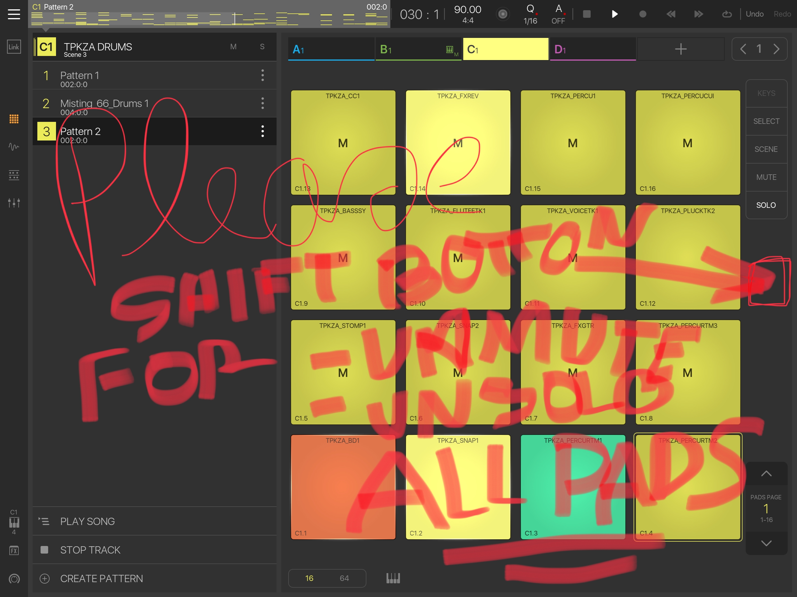
Ok I know that my screenshots are sh%4t but who was never at this point that you are playing around with mute fonction on a drum part and failed an multi finger unmute ?
My idea is to create a shift boton that allows you to unmute or unsolo all selected pads in one clic. And this shift boton could be present on each page to give more futur requested option, saving screen space.
Yep BM3 needs shift button in left column. For this mutes/solos function and a TON of other potential uses. 100% guaranteed workflow improvement addition for a ui with so little space. It's the standard workaround on hardware that has similar struggle with space/buttons.. hopefully be added at some point..
I'm still fairly Android/Windows/MacOS centric, so long press/Right click is still more ergonomic to me personally (Again this is personally, just my opinion, nothing more nothing less)
Long press, drop down appears with unmute all or unsolo all would suite me more (As i said, just my opinion, nothing more)
Thinking long term about BM3, gonna run out of screen space super fast if add a button for everything that needs instant access Shift button is def the way to go on this one...
Comparing BM3 to my Elektron boxes, the Shift button is a really valuable UI tool on the Elektron boxes where space is also limited. And a LOT of other potential uses for it in BM3 besides the kill all mutes/solos..I'd suggest implementing it ASAP so it's there as an option for solution when solving other relevant requests...
And being on ios instead of hardware intua have the advantage of buttons labelling being able to change when shift is held. So it'd be easy to know what button does what..
Off top of head some other uses that'd streamline workflow without using additional screen space or current pop-up menus -
Shift +
Sample edit param knobs = all layers
Drag pattern edge = trim pattern (no more accidentally moving when intending to trim and vice versa)
Tap pad = select pad/s (for future 'multiple pad' commands)
Tap note in piano roll editor = mute/unmute note.
Place notes in piano editor = 'quick placement' mode. So when placing multiple notes in succession you don't have to do two taps per note.
I could go on indefinitely some of these things would benefit from their own dedicated buttons. But space'll run out eventually so having 'shift' there as an option asap makes a lot of sense...
Also stuff like shift + tapping a pattern in the pattern browser window opens it in piano roll editor.. And navigation stuff. Like maybe shift + long hold on a pad opens up that pad's piano roll editor.. Things like that would need to be thought through more than I am doing here tho....
Once you had all that stuff down in muscle memory it would make for a way faster UI for performance and editing...
I dont think we will see shift buttons anytime soon on the iPad version, not least because the shift button would always need to be under the carrying hands thumb, and with the different ways a 9.7/10.5/12.9 could be held, it would need to be some kind of floating shift button or you would have to put the iPad down to press it.
But i could be completely mistaken the direction they want to take Beatmaker
I doubt many people are using BM3 while holding their ipads aloft but even so, bottom left column, above the keys icon, is perfect, even when ipad is held like that maybe make it double height of other icons there so it can be 'held' comfortably. In terms of ergonomics its no different from playing keys and tweaking an AU's knobs.. You can't do that while walking around holding an ipad either
Not sure what you mean by 'direction'? I think we're all trying to get to the same place - fluid functionality.....
Shift button basically = a substitute for mouse right button or shift/Ctrl key on a computer keyboard... Obvious UI addition to streamline things without clutter and/or menu diving imo. Even desktop daws make use of right mouse/ctrl/shift... They don't just have have left mouse click (equivalent of human finger on bm3) and 'button per function'... Considering BM3 is already handicapped in many ways against normal daw workflow down to no mouse and smaller screen, it should probably use every trick in the book to try and offer an equally fluid workflow

Comments
Ok I know that my screenshots are sh%4t but who was never at this point that you are playing around with mute fonction on a drum part and failed an multi finger unmute ?
My idea is to create a shift boton that allows you to unmute or unsolo all selected pads in one clic. And this shift boton could be present on each page to give more futur requested option, saving screen space.
What do you think about it ?
I'm still fairly Android/Windows/MacOS centric, so long press/Right click is still more ergonomic to me personally (Again this is personally, just my opinion, nothing more nothing less)
Long press, drop down appears with unmute all or unsolo all would suite me more (As i said, just my opinion, nothing more)
Exactly !!!
So then a button just for that control is what you want, not a shift button ?
That would be snappier right ?
Comparing BM3 to my Elektron boxes, the Shift button is a really valuable UI tool on the Elektron boxes where space is also limited. And a LOT of other potential uses for it in BM3 besides the kill all mutes/solos..I'd suggest implementing it ASAP so it's there as an option for solution when solving other relevant requests...
Off top of head some other uses that'd streamline workflow without using additional screen space or current pop-up menus -
Shift +
Sample edit param knobs = all layers
Drag pattern edge = trim pattern (no more accidentally moving when intending to trim and vice versa)
Tap pad = select pad/s (for future 'multiple pad' commands)
Tap note in piano roll editor = mute/unmute note.
Place notes in piano editor = 'quick placement' mode. So when placing multiple notes in succession you don't have to do two taps per note.
I could go on indefinitely
Also stuff like shift + tapping a pattern in the pattern browser window opens it in piano roll editor.. And navigation stuff. Like maybe shift + long hold on a pad opens up that pad's piano roll editor.. Things like that would need to be thought through more than I am doing here tho....
Once you had all that stuff down in muscle memory it would make for a way faster UI for performance and editing...
EDIT*")
I did write a reply about why i dont like shift buttons, but it would just go on and on, so removed
I dont think we will see shift buttons anytime soon on the iPad version, not least because the shift button would always need to be under the carrying hands thumb, and with the different ways a 9.7/10.5/12.9 could be held, it would need to be some kind of floating shift button or you would have to put the iPad down to press it.
But i could be completely mistaken the direction they want to take Beatmaker")
Not sure what you mean by 'direction'? I think we're all trying to get to the same place - fluid functionality.....
Shift button basically = a substitute for mouse right button or shift/Ctrl key on a computer keyboard... Obvious UI addition to streamline things without clutter and/or menu diving imo. Even desktop daws make use of right mouse/ctrl/shift... They don't just have have left mouse click (equivalent of human finger on bm3) and 'button per function'... Considering BM3 is already handicapped in many ways against normal daw workflow down to no mouse and smaller screen, it should probably use every trick in the book to try and offer an equally fluid workflow
Agree to disagree")