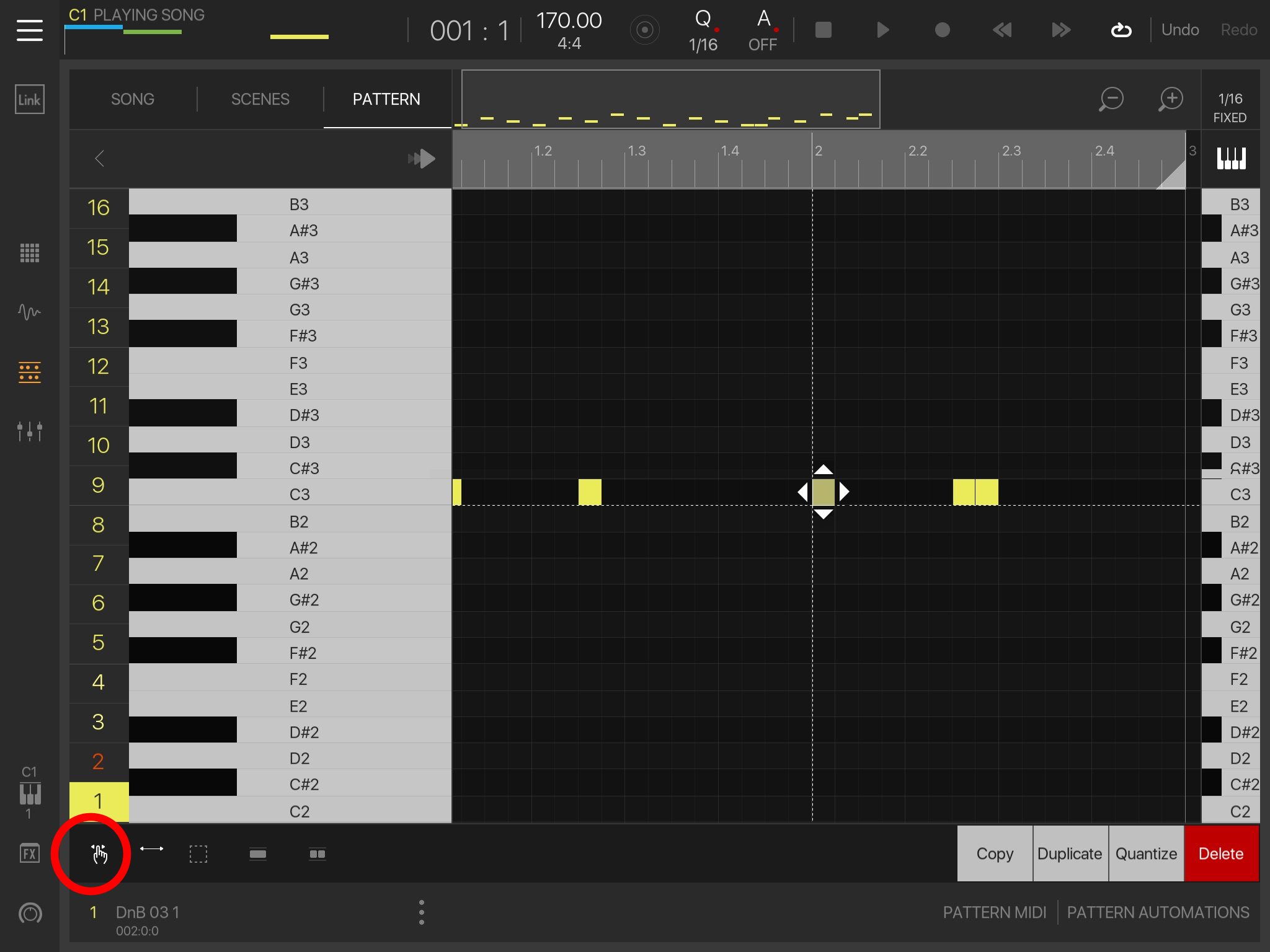
Dotted white lines vs arrows (mock ups) post your ideas
Discuss the white lines vs arrows apocalypse (yes it was yesterday and today i have calmed down)
Any ideas i will try to knock up quick mocks ups for the developers to look at, hopefully we can find a nice compromise between all of us.
Heres idea 1
Two tools
Tool 1 is move, grab area item or lines
Tool 2 is sizing, grab left side of item/line to shrink/expand the start of the item, grab right side of item/line to shrink/expand the end.


Comments
@5pinlink - Fantastic! That'll work for me! +100
Even for tool 2 (sizing) the arrows will work for resizing very short notes when you can't grab the left or right dotted lines.
Great... except note that the grab tool does double-duty as a pen for creating new notes.
Yeah this is only selected states, it can't draw when a note/item is already selected.
Basically all we are doing is refining tool 1 (pan/grab/draw/move tool)
And creating a new tool 2 (pan/grab/draw/size tool)
So both tools would still pan the view or select (grab) notes/items
First one would move when a note is selected or draw when no note is selected.
Second one would size when a note is selected or draw when no note is selected.
I still think pan should be added to the insert tool too to be honest though.
Great idea! I think you could even leave the second tool out: lines are only for moving, arrows only for resizing. So you would only have the left an right arrows left for resizing an event (midi or audio) and two dotted lines for moving the event.
The length of the event would not matter, becuase even very short ones would still only have one line...
@denx the thing is, some people actually want the arrows for moving, i was with you at first, but any idea we push towards the devs has to cover all users.
@5pinlink not trying to push my agenda, either way works for me
I understood the main issue people had with the lines was that with very short notes you have to zoom in in order to move the right line. I just figured that if you only have one line this would put a swift end to that particular hinderance
I might have missed some things, though, that happens...
yeah thats why i went for the single line (Cross hair) and i did agree with you entirely about just lines for move and arrows for shrink/expand, but reading here and AB it seems a couple of people like the arrows for moving, and obviously the devs do too, so more chance to get what we want if we incorporate the two hahaha
@denx @5pinlink I'm all for lines for moving and arrows for shrink/expand.
@mathieugarcia on a slightly different note: from @5pinlink 's mockup I see there is plenty of room on the right for a "mute" button next to copy, duplicate, quantize, delete! (mute individual midi note in pattern - a function I have been dreaming of from the very beginning)
@5pinlink not trying to push my agenda, either way works for me
I understood the main issue people had with the lines was that with very short notes you have to zoom in in order to move the right line. I just figured that if you only have one line this would put a swift end to that particular hinderance
I might have missed some things, though, that happens...
Looking at this thread carefully! Thanks everyone for your feedback, I'm sure we'll find the perfect solution :-)
@denx : mute lines are requested pretty frequently; that makes sense. In a way, it's already there via the "mute midi only" on the pads MUTE mode, hah!
Very nice! But I think the credit for this question must go to @gosnote unless I inadvertedly requested something I don’t really understand
Sorry to have taken this slightly off topic: to be honest I haven't tested the mute midi only on the pads MUTE mode, but what I am requesting is I think a different thing @mathieugarcia : in pattern/pianoroll view, mute/unmute a single note (vs. mute all notes in a pattern = pads mute). A very useful and basic midi editing function, don't you think?
Like @triton100 says "Means you can quickly experiment with melodies without losing previous versions". This is key to my workflow at least, for percussive as well as melodic sequences.
It cant be done with one tool unless you use a shift button (Which is basically two tools anyway haha)
The problem is that some people want arrows to move, some people want lines to move (Lets forget shrink/expand for now, because we don't even know if the developers have any interest in that at all right now) so the only way to do it without prefs settings is to have both.
Obviously with prefs settings then you can do all kinds of combos to do whatever you want, that is my preferred set up entirely.
Preferences
Vertcial line - two tick boxes move and or size
Horizontal line - one tick box off/on (Always moves if on)
Horizontal arrows - two tick boxes move and or size
Vertical arrows one tick box off/on (Always moves if on)
With those prefs you can do old way, current way, version mocked up above, book a flight and get it to ride a roller coaster in Florida, but its the devs who need to design it, but yeah the prefs option is massively more advanced than any other and my personal preference, it was the only way that Mute would work for everybody, and may well be the case here.
A small ‘note length adjustment handle’ (the white dot) appears to the right of any given selection. A ‘4 arrow icon’ that never overlaps the note length dot can be used for movement. When zoomed in the whole selection box that contains the notes could be used for movement. Tap outside the selection box to deselect. Dotted lines work once again as they did.
...
If extra visual reinforcement is needed for the selected area it could simply be tinted.
Works pretty much like gadget right now, personally i can't stand Gadget, but i am rare i suspect.
Did you have any issues with 3.03 in this regard? I was completely fine with it.
If the devs could say what it was they were trying to address with the recent update I would be into thinking of specific solutions to those points. My sketches were more in response to the only issue I could understand with 3.03 that I heard (but honestly did not share as a priority) which was that when zoomed out it was difficult for some people to pick between adjusting note length or horizontal position of short notes.
But really if they were to just roll back to the selection/movement method in 3.03 I would be totaly happy. In any case I just want dotted line control back.
100%
On a mildly bumpy commute the new method is frustrating enough for me to avoid updating my main ipad.
...maybe.
Not having prefs = less complicated, but it also means that you work the way the software works rather than the software working how you work.
Reaper is a perfect example, takes a while to set up for each user how they want, once its done it is the fastest package on the market.
So it is 50/50.
And we can also take the new mute prefs as an example too, without those prefs the userbase would have never been happy.